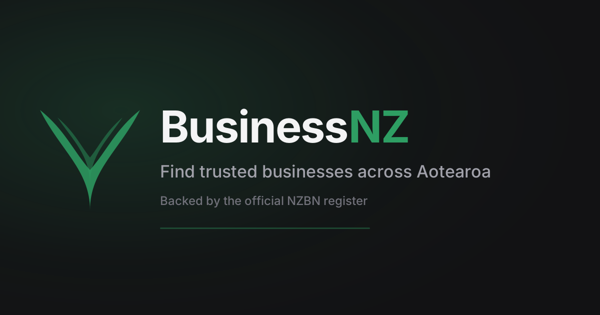
Black, white, and fern green.
BusinessNZ’s identity is deliberately restrained: ink-black type, clean white space, and a single fern green that carries every signal of trust and growth. Silver and gold are reserved, earned accents — never decoration.
The fern mark
A koru-inflected fern frond — New Zealand's most recognisable native symbol, reduced to two overlapping leaves. It reads as a check mark from a distance: verification is the whole point.
Full lockup — mark plus wordmark, used in the header, footer, and anywhere the brand introduces itself for the first time on a page.
Mark alone — favicons, app icons, social avatars, and tight spaces where the wordmark won’t sit comfortably.
Do
- Keep clearspace around the mark equal to half its height.
- Use the solid fern-green mark on white or the palest surfaces.
- Use the white/light mark on black or deep fern backgrounds.
Don’t
- Recolour the mark to gold, silver, or any hue outside the palette.
- Stretch, rotate, or add drop shadows or outlines to the mark.
- Place it on busy photography without a scrim behind it.
Logo mark ideas
The fern mark above is still the one in production. These are exploratory directions we could take the mark instead — mocked up here for discussion, not live anywhere on the site.
Compass pin
A map pin with a compass needle at its core — discovery, plus direction.
Verified shield
Leads with trust over discovery — the checkmark is the whole mark.
Directory grid
Four listings, one highlighted — reads as a directory before anything else.
Koru spiral
A single koru frond — quieter and more abstract than the current double fern.
Storefront check
A literal shopfront with a verification tick — unmistakably "business".
Network nodes
Three connected businesses — a web of trust rather than a single symbol.
Southern Cross
NZ's constellation, reduced to a mark — distinctly Aotearoa, no fern needed.
Infinity loop
Business and customer, connected — reads as handshake or infinity depending on angle.
Bookmark flag
A saved listing tag — leans into "claim it, save it, find it again".
Islands pin
North and South Island silhouettes nested inside a location pin.
A palette of three, plus two earned accents
Black and white do the heavy lifting. Fern green is the one colour BusinessNZ owns — used for actions, links, and anything alive. Silver and gold only ever mean one thing: verified, and featured.
Ink
Foreground, text
oklch(0.17 0.006 260)
White
Surface, background
oklch(1 0 0)
Fern
Primary — actions, links, growth
oklch(0.5 0.14 152)
Fern deep
Hover, pressed states
oklch(0.4 0.13 152)
Silver
Verified badge only
oklch(0.46 0.014 260)
Gold
Featured badge only
oklch(0.52 0.13 75)
Surface
Cards, panels
oklch(1 0 0)
Surface 2
Section backgrounds
oklch(0.95 0.005 260)
Colours are defined in oklch() and adapt automatically between light and dark mode — see src/styles.css. Never hard-code a hex value; reference the token (text-primary, bg-gold, etc.) so the mark stays correct in both themes.
Two typefaces, clear jobs
Plus Jakarta Sans carries headlines and anything that needs presence. Source Sans 3 handles body copy, UI labels, and long-form reading.
Display — Plus Jakarta Sans
Aa Bb Gg
Trusted trades, verified.
Eyebrows & labels — semibold, wide tracking
Body — Source Sans 3
Aa Bb Gg
Every verified listing carries its official New Zealand Business Number — a trust signal you can check yourself, not a badge we made up.
Badges mean exactly one thing each
Hexagon badges are the graphical face of the trust system — used wherever a listing's tier needs to be seen at a glance. Never recolour them or use gold/silver for anything else.
NZBN Verified
Silver hexagon
Featured
Gold hexagon
Website WOF
Green hexagon — no shield accent
Māori Business
Pounamu hexagon — koru, no shield
Size variants
At small size the inner facet and shield accent are dropped automatically — detail that only reads at a distance becomes noise once it's this compact.
Silver — Verified. The listing's NZBN has been checked against the official register.
Gold — Featured. A paid placement. Always disclosed, never disguised as verification.
Green shield accent. Carried by Verified and Featured only — it's the "this is a real, checked business" signal.
Green pulse — Website WOF. Automated warrant-of-fitness check for a business website — a live score, not a trust claim, so it never carries the shield.
Pounamu koru — Māori Business. The business identifies as Māori on the NZBN register. Free recognition, not a paid tier — no shield accent.
Still used as-is
UnclaimedA backlink businesses want to add
Verified and Featured businesses can copy a self-contained embed onto their own site footer — no external image or script, just inline SVG and a real link back to their BusinessNZ profile.
Generated per-business in the dashboard under My Listing → Embed badge, gated to Verified tier and above.
Plain, direct, provably true
BusinessNZ never oversells. Every claim about trust should be checkable — that discipline is the brand as much as the fern is.
Say what's verifiable
Prefer facts sourced from the NZBN register over adjectives. “NZBN Verified” beats “trusted”.
Kiwi, not corporate
Warm and direct, the way a local would describe a business to a neighbour. No filler, no hype.
Bilingual respect
Te reo Māori terms (Aotearoa, ngā pakihi Māori) are used naturally, not as decoration.
Quiet confidence
Fern green and restraint do the persuading. We don't need exclamation marks or gradients everywhere.
Download
Source files for the mark and social image.